Roadmap Visual Patterns

Through their workshops and coaching, Phil and Justin have seen countless roadmap visuals—some clear, others confusing. As teams balance strategy and execution, common visual patterns emerge from real-world challenges in communicating priorities and uncertainties.
We’re sharing 14 roadmap patterns to help teams move beyond rigid formats and adopt styles that better serve their needs. Choosing the right visual can mean the difference between alignment and confusion.
One example is the radial roadmap. Introduced to many companies, half have adopted it as their primary format. It challenges left-to-right time models, emphasising ambiguity and optionality over fixed deadlines. Roadmaps aren’t just plans—they’re communication tools that shape decisions and outcomes.

Traditional
Gantt
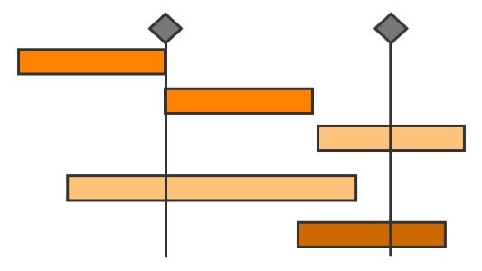
A classic, timeline-based roadmap showing tasks and dependencies over fixed periods. While useful for tracking deadlines, it can give a false sense of certainty about delivery dates and lacks flexibility for agile teams.
Board
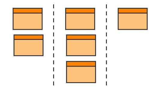
A roadmap structured like a kanban board, using columns, but typically flowing in the opposite direction. Often using categories like “Now, Next, Later.” This format is useful for visualising timeframes instead of timelines but can blur the line between a roadmap and a backlog.
Table
A structured list format, usually in a spreadsheet, offering a clear but static way to organise roadmap items. It works well for internal documentation but lacks visual impact for storytelling.
Ambiguity
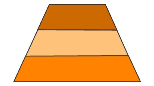
Funnel
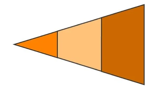
A roadmap that widens over time, reflecting greater uncertainty in future plans. It visually communicates that details become less fixed as timelines extend, helping stakeholders understand strategic flexibility.
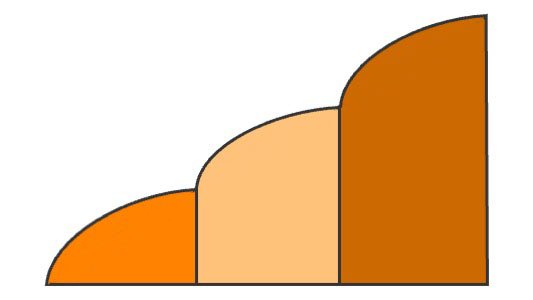
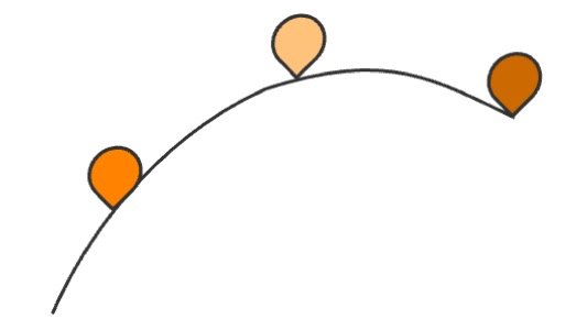
Crawler
A roadmap that appears to recede into the distance, much like the opening text crawl in Star Wars. This format can emphasise long-term vision while making near-term actions clearer.
Radial
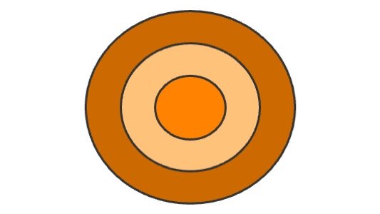
A circular format where roadmap items radiate outward over time. This disrupts the left-to-right time perception, encouraging teams to focus on strategic intent rather than rigid timelines.
This format changes the conversation to something being “on the radar”.
Horizons
Inspired by McKinsey’s 3-Horizons model, this roadmap separates initiatives into three categories: Core (current business), Growth (emerging opportunities), and Future (long-term bets). It provides a structured way to balance innovation with sustaining existing success.
Territory
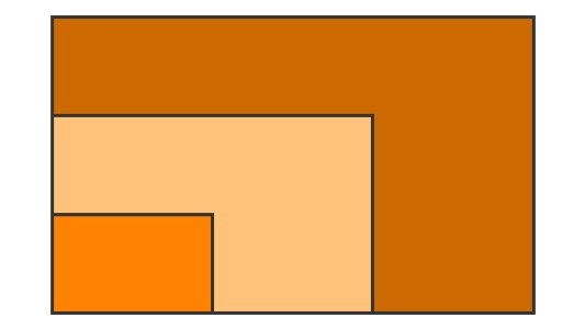
A roadmap grouping initiatives into current, next, and future focus areas, illustrating strategic expansion. It clarifies priorities but may lack time-specific commitments, instead focusing on where and how the expansion is planned. Change the conversation to what “territory” you will occupy.
Linear
Sequence
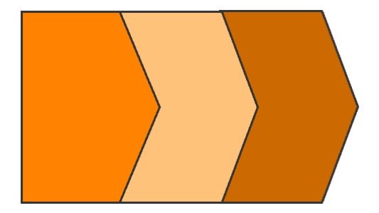
A simple left-to-right flow of planned initiatives, with major milestones highlighted. While easy to follow, it can oversimplify dependencies and uncertainties in complex product planning.
Road
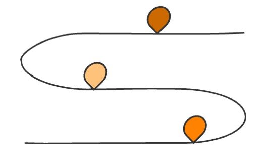
A roadmap visually represented as a road with milestones along the way. This storytelling-driven approach helps communicate progress and direction but may lack precise details.
Moonshot
A high-level roadmap that focuses on ambitious, long-term goals rather than immediate execution. It’s useful for innovation-driven teams but can feel disconnected from short-term realities.
Domino

A sequential roadmap where each initiative enables the next, leading to a major strategic goal. It highlights how one aspect unlocks or enables the next, magnifying impact in the long term.
Miscellaneous
Tree

A structured tree that may take many forms. One example may be the Opportunity Solution Tree that maps out opportunities (problems to solve) and their potential solutions. This format is particularly useful for discovery and prioritisation, aligning teams with problem-focused thinking. Timing information is limited but some sense can be provided through ordering. The advantage is that is shifts the conversation to value creation over when.
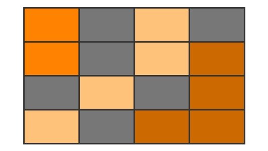
Plot
A roadmap where initiatives are plotted based on their proximity in time versus another dimension. A common second dimension can be the level of risk. This format helps teams have an candid conversation about that other dimension and the reality of of the items shown on the roadmap are likely to ever be delivered.
What have we missed?
After looking at 100s of roadmaps these are the most common patterns we have identified but we are sure there are more out there. Do you have another pattern? We’d love to hear from you about it and how it helps your organisation.
Detailed Visual Guide COMING SOON!
We are hard at work expanding on this basic introduction to the visuals, digging into the different visual elements of each of these patterns so you can implement them in your organisations because more roadmaps SUCK!
If you want to find out about the guide when it is available sign-up to the mailing list below we’ll also let you know about the latest episodes of the podcast as they are released.